Erlesen
Technology
Branding | UI/UX Design | Web Development | Motion Graphic

ABOUT THE PROJECT
A curated reading app needed a brand that could cut through the noise of endless digital content while still feeling calm, literary, and human.
At the heart of the brand is a simple idea, a story for every pause. Erlesen delivers one carefully selected story each week, giving readers a chance to slow down and enjoy culture in small, thoughtful doses.
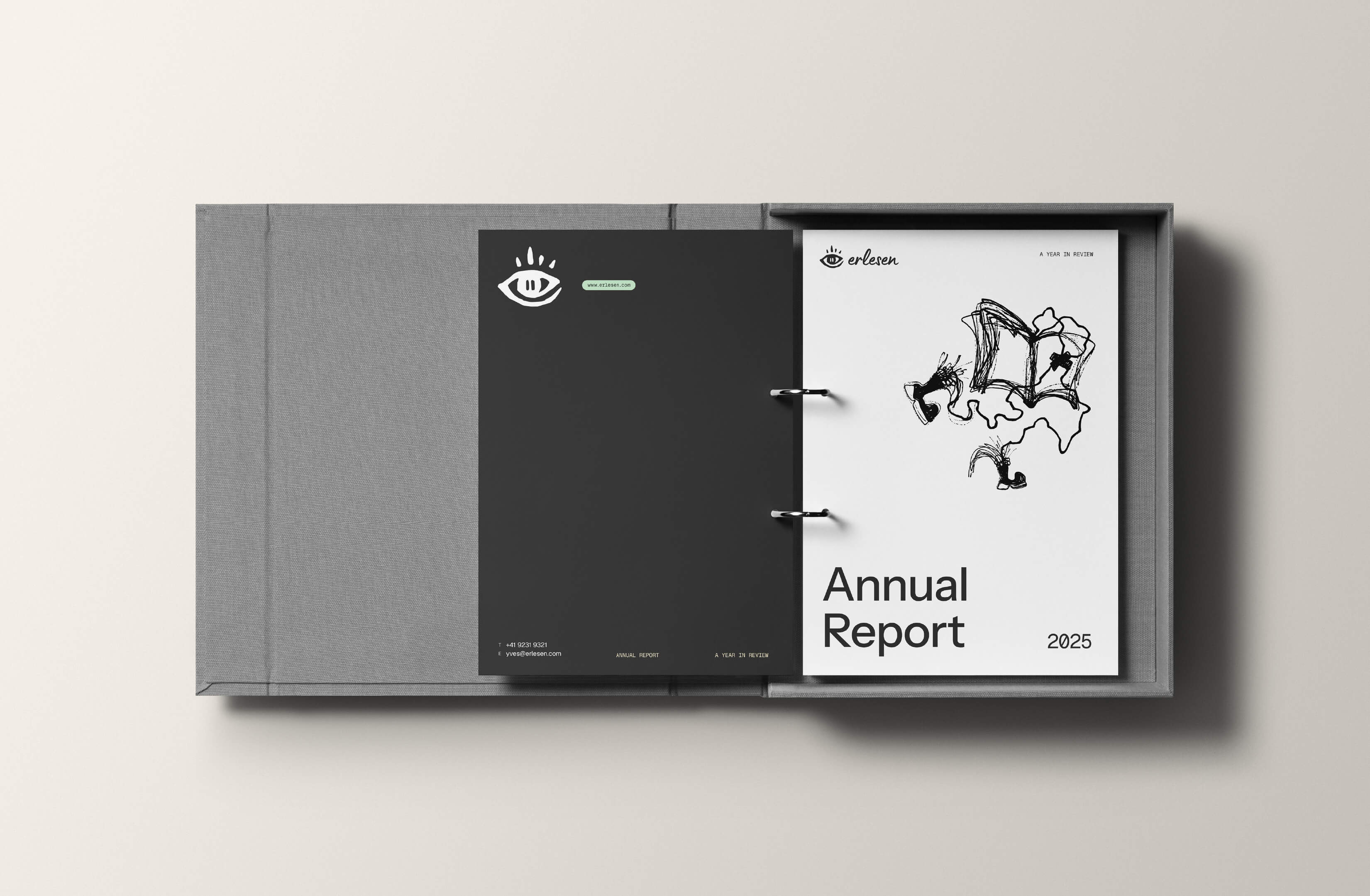
We translated this philosophy into a brand voice and visual system that feels curated, minimal, timeless, and humane. To complement the identity, we integrated artwork from Absurd Design, whose sketch-like style added warmth and playfulness while maintaining Erlesen’s calm and curated feel. Overall, it's an identity that reflects both the quality of the stories and the pause they create in everyday life.
Visit the website at www.erlesen.swiss


A story for every pause.
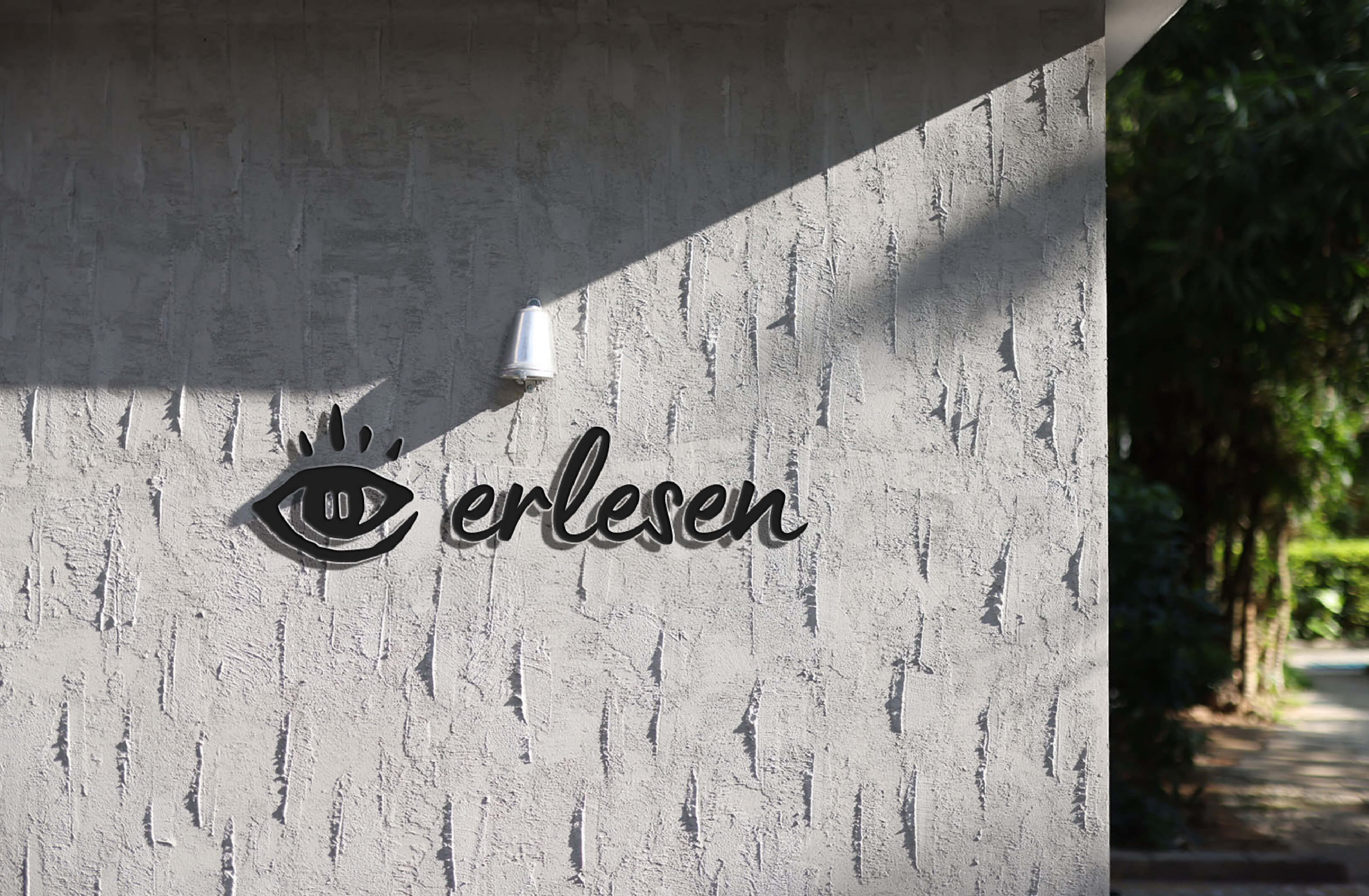
The Erlesen logo is designed to be both meaningful and versatile. Its hand-drawn form, shaped like an eye that subtly forms the letter "e" reflects the brand’s focus on observation, calm, and thoughtful reading.
At its center lies a subtle pause symbol, reinforcing Erlesen’s promise of daily stillness and reflection. While organic in appearance, the mark is intentionally crafted for clarity and recognition across digital and print. Its unique structure allows it to work as both a stand alone icon and as part of a broader identity system, making it a visual anchor for the poetic rhythm Erlesen offers every day.


what our client say
I'm very satisfied with the end product. The quality of the work, adherence to deadlines, and creativity were all top-notch. I can highly recommend Jonathan and his team.
Yves Gsell
Founder of Erlesen


